Falk-U (University): A Discussion on Leader Lines
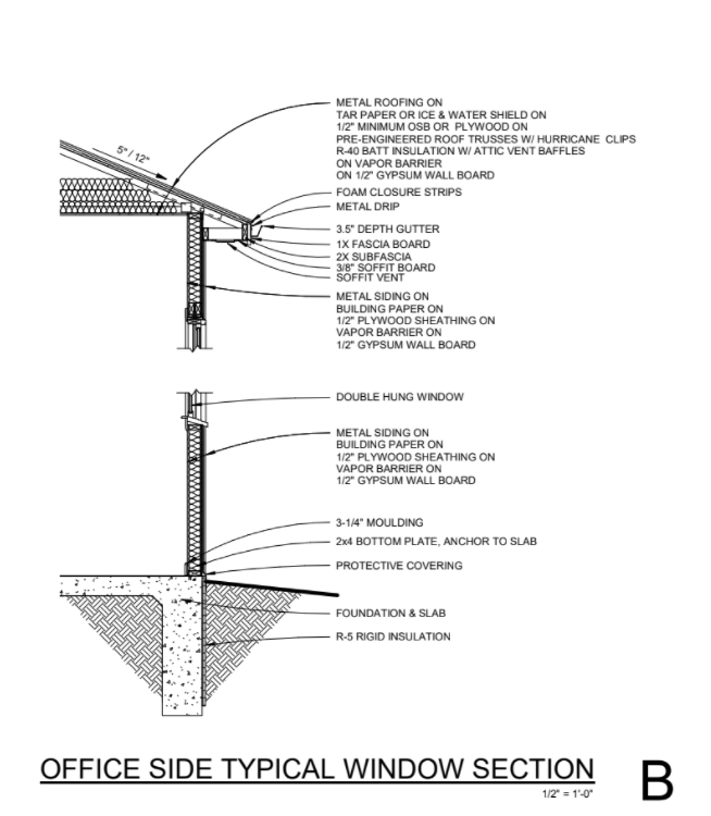
Most Architects use straight leader lines on their construction documents. They are wrong. There have been endless debates on the subject, mostly centered around aesthetics for either straight or curved leader lines.
We don’t care about the aesthetics one way or another, however we do care about creating a legible set of construction documents that make the construction process easier.
Straight leader lines often are difficult to discern if they are leader lines or lines describing part of the building (because most buildings are orthogonal or at least are mainly orthogonal).
Curved leader lines distinguish themselves as different that the building drawing and therefor add additional legibility to the drawing. In our opinion, the case is closed.
We also advocate for minimizing the amount of leader lines. We’ve seen Architects have a wall section with 20+ callouts on it each with it’s own leader line. There are leader lines everywhere and it sometimes makes it difficult to read the drawing.
We advocate for descriptions grouped together with a single leader line pointing to the area. For instance the contents of a wall could be described as such:
Exterior siding on
Air Barrier on
2x6 wood framing on
batt insulation on
vapor barrier on
5/8” Gyp
Rather than having a leader line for each item what we typically do is have a leader line that points to the outside edge of the wall then we create another leader line that overlaps the first and points to the inside face of the wall, similar to below.
If there is a callout on the section, we don’t describe the contents of the call out on both the section and the enlarged detail. It will only have callouts and leader lines on the largest scale drawing.
Example of curved leader line use in architectural/engineering construction drawings. Curved and reduced quantity of leader lines improves legibility.

